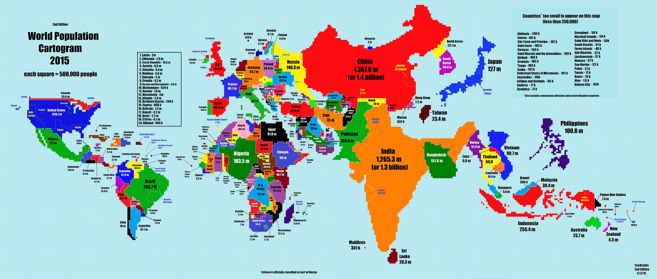
Created by the Reddit user TeaDranks, this fascinating map of the world represents how the world would look if all countries had an area proportionate to their population in relation to the world as a whole.
On this map, every square represents 500,000 people. And as you can see the world doesn’t really look like we are used to. Some countries are perhaps a surprise when it comes to large size, especially in Africa. Others when it comes to small sizes, perhaps for example Australia that almost disappears.
But what is more interesting perhaps is the countries that actually do look like we are used to seeing them.
Check out the link to Reddit below for more information.
_______________
Reddit: World Population Map
______________________________